

Cordelia
Making school admissions easier to navigate—from inquiry to enrollment
Overview
Role
Product Designer (UI/UX)
Timeline
5 weeks (80+ hours)
Tools
Figma · ChatGPT (research synthesis support)
Initial inquiry flow from the school’s website.
Application to enrollment flow after signing up for a Cordelia account.
Cordelia is a management platform for Montessori schools. I partnered with Clever Education Solutions (CES) to redesign its parent-facing admissions experience, helping families understand their progress, their next step, and when they needed to wait for the school.
Problem: Parents needed to know what happens next
CES had received feedback that parents found Cordelia difficult to navigate. The admissions journey involved several stages, but families needed clearer guidance about their progress, available actions, and what would happen after submitting information.
My goal was to connect inquiry, tour, application, decision, contract, and enrollment into one understandable journey.
I focused on three priorities:
Make completed, current, and upcoming steps visible.
Distinguish parent actions from steps handled by the school.
Provide useful context and reassurance without overwhelming families.
Administrators needed connected tools; families needed clearer guidance
Overview
Research & Insights
Affinity Map
Fragmented tools created more work—and less guidance for families
I interviewed five Montessori school administrators to understand how they managed admissions and communicated with prospective families. My teaching background helped me ask informed questions about school workflows and family relationships.
Three findings shaped the redesign:
Admissions tasks were spread across tools for tours, applications, agreements, and payments. Administrators filled the gaps through manual communication.
Administrators described recurring parent questions about tuition, Montessori education, timelines, and next steps.
School tours and personal communication played an important role in helping families assess whether a school was right for them.
I grouped the findings into themes and prioritized a connected journey, clearer instructions, and accessible school information.
Research themes pointed to guidance, trust, and usability
I used ChatGPT to support research synthesis by helping organize interview findings and explore recurring themes.
I reviewed the suggested themes against my interview notes and selected the findings that informed the design.
The affinity map revealed four key themes:
parents’ common questions and concerns
the importance of building trust with families
usability challenges for both parents and administrators
the value of CES’s personalized customer support.
Because this warm, trusting support distinguishes CES from its competitors, the digital experience needed to reflect the same sense of guidance and connection.
Clarifying who acts next at every admissions stage
Overview
User flow
The flow separates parent tasks from school responses
I mapped the admissions journey to identify who was responsible for moving each stage forward. This exposed an important distinction: parents sometimes needed to complete a task, while other stages required a response from the school.
I used that distinction to structure the experience around visible progress and explicit next steps. Families needed to understand both what they could do and when no action was required.
This became the foundation for the step-based cards, status indicators, and waiting-state messages.
Added context before inquiry and guidance throughout admissions
Overview
Low fidelity wireframes
Responsive Layout
Families could learn about the school before submitting an inquiry
Before asking parents to share their information, I included details about the school, its Montessori approach, and the admissions process.
This responded to administrators’ reports that families needed context before deciding whether to proceed. The inquiry experience needed to introduce the school as well as collect information.
I adapted the admissions journey across mobile, tablet, and desktop
The initial wireframes focused on the mobile experience. After validating the core flow, I explored how key screens would adapt to larger viewports before finalizing the responsive designs. These simplified wireframes document the layout, hierarchy, and navigation decisions used to translate the experience to desktop.
Testing revealed where families needed clearer instructions
Overview
Usability test findings & iterations
Testing exposed unclear instructions and uncertain next steps
Five participants, which included parents, teachers, and school administrators, completed tasks including submitting an inquiry, starting an application, reviewing an admission decision, and identifying what to do next.
I checked whether they understood the terminology, recognized their current status, and could identify available actions.
Testing highlighted three areas to improve:
The inquiry needed to feel simpler and more personal.
Application instructions needed clearer upload requirements and progress information.
Status messages needed to distinguish actions from waiting periods.
I revised the instructions, confirmations, progress indicators, and calls to action around these findings.
I redesigned the decision card to make waiting unmistakable
The decision stage needed a clearer distinction between a pending update and an action parents could take.
I revised the card’s visual treatment, used color alongside clearer status text, and added reassurance such as “no action needed now.” The message explained that the school was responsible for the next update.
This addressed the confusion directly instead of relying on parents to interpret the card’s appearance.
Final Design
Overview
Final design
Impact & business value
Reflection & next steps
Initial inquiry flow from the school’s website.
Application to enrollment flow after signing up for a Cordelia account.
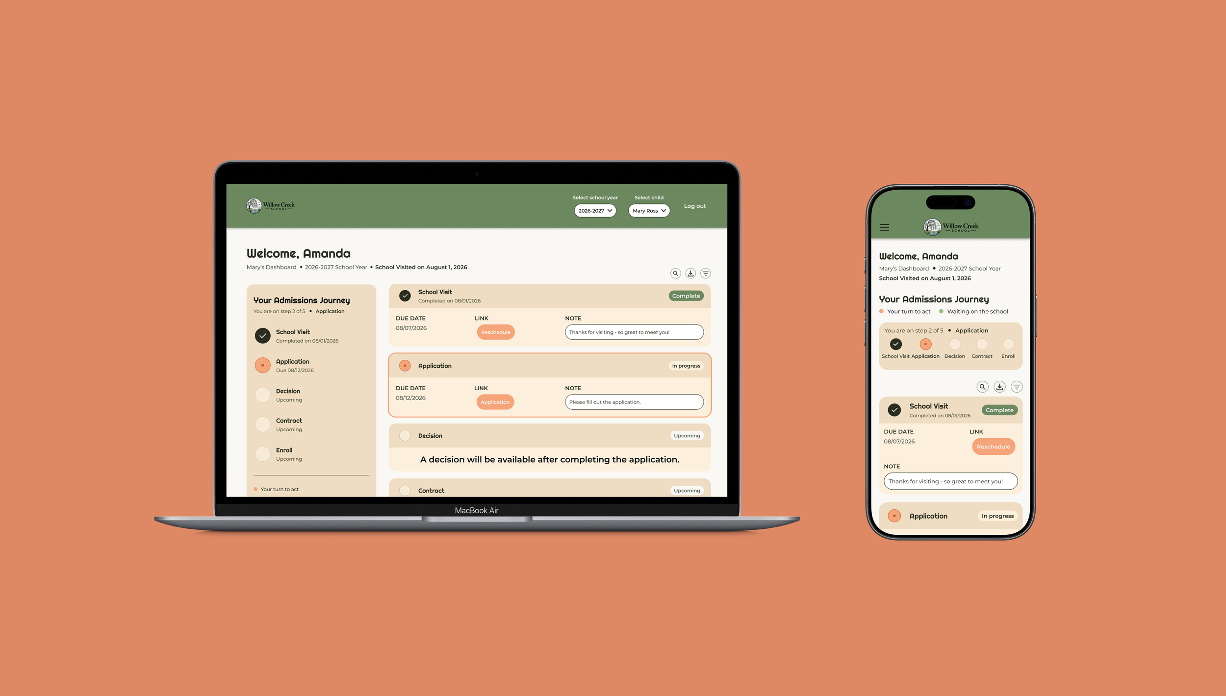
One connected journey, with guidance at each stage
The final prototype connects the parent-facing admissions stages through consistent navigation, progress indicators, and next-step guidance.
Families can:
Learn about the school before submitting an inquiry.
Understand their application progress and required information.
Recognize when they need to act and when they are waiting.
Continue from an admission decision toward contract and enrollment.
I designed the experience for desktop, tablet, and mobile.
Clearer guidance could reduce follow-up and admissions drop-off
The redesign aims to help families move through admissions with fewer unanswered questions. For schools, clearer instructions and status messages could reduce repetitive follow-up and make communication more consistent.
These are expected benefits, rather than measured business outcomes. To evaluate them after implementation, I would track:
Completion and drop-off at each admissions stage.
Support requests about status, uploads, and next steps.
Whether parents can identify their next action without assistance.
Next: validate waiting states and school-specific workflows
This project taught me that status messages are part of the service experience. Explaining who acts next can provide practical guidance while preserving a school’s personal approach.
I would next test the revised experience with parents and administrators using school-specific admissions scenarios. I would focus on waiting states, decision messaging, and differences between schools’ processes.
Their feedback would help determine which parts of the journey should remain consistent and which need flexibility.