
Kin
Helping people step outside their comfort zone
Background
Trying something new can be exciting, but taking the first step is often the hardest part. Through user research, I discovered that many people wanted to explore new hobbies, attend local events, and meet new people, but uncertainty, fear of going alone, and difficulty finding like-minded individuals often prevented them from acting. Existing event platforms focused primarily on discovery rather than helping users feel confident enough to participate. This project explored how thoughtful product design could lower those barriers and create a more approachable way for people to discover experiences and build connections within their communities.
Problem
People who want to grow often lack a supportive community of like-minded individuals to encourage them, share experiences, and make trying new things feel less intimidating. Without social encouragement and relatable examples, many hesitate to step outside their comfort zones or struggle to stay motivated.
Project Goals
The goal of this project was to design a mobile experience that makes trying something new feel accessible, social, and low-pressure. To achieve this, I focused on three objectives:
Reduce uncertainty by providing users with the information they need to confidently evaluate an experience before committing.
Foster connection by creating opportunities for users to discover experiences alongside others with similar interests and a shared desire to try something new.
Encourage participation through an intuitive onboarding process, personalized recommendations, and a streamlined journey from discovery to registration.
Overview
User interviews
Competitor Analysis
Research synthesis
Design opportunity
Uncovering Opportunities Through User Research
Methodologies
I began the project by interviewing people who were interested in personal growth and trying new experiences. While participants expressed excitement about learning new skills and exploring hobbies, many admitted they rarely followed through. Their hesitation wasn't due to a lack of interest; rather, it stemmed from uncertainty about attending alone, not knowing what to expect, and struggling to find people who shared their interests.
I compared Day One, The Nudge, and Fabulous to understand how existing products support reflection, exploration, and personal growth. While each addresses part of the experience, none combines discovering new activities, connecting with others, and reflecting on how those experiences contribute to growth. This revealed an opportunity for Kin to create a more complete and socially engaging journey.
Research Synthesis
After completing the interviews, I organized observations using affinity mapping to identify common patterns across participants. These themes consistently emerged: people wanted a supportive community, they needed reassurance when taking the first step on their own, and they wanted opportunities that felt approachable rather than intimidating.
The Design Opportunity
Rather than creating another event discovery platform, I reframed the opportunity around reducing the emotional barriers associated with trying something new. The product would focus on helping people discover beginner-friendly experiences, understand what to expect before attending, and connect with others who were also participating for the first time.
Overview
Persona development
MVP features
Information Architecture
Translating Insights into Product Requirements
Persona Development
Using the interview findings, I developed personas that represented users seeking personal growth through new experiences. Problem statements helped translate research into actionable design goals, ensuring every feature addressed a real user need instead of assumptions.
To maintain focus, I identified features that delivered the most value while remaining achievable for an MVP. Core functionality included personalized onboarding, local experience discovery, detailed experience pages, and a streamlined registration flow. Community features such as messaging and group chats were intentionally deferred to future iterations.
Prioritized Features for an MVP
Designing the Information Architecture
I created user flows and site maps that guided users from onboarding to browsing, evaluating, and joining experiences. Organizing information into clear stages allowed users to quickly understand an experience while providing additional context before committing.
User flow
Site Map
Overview
Personalized recommendations
Quick decision-making
Build confidence
Branding
Designing a Community Driven Experience Discovery Flow
Personalized Recommendations from the Start
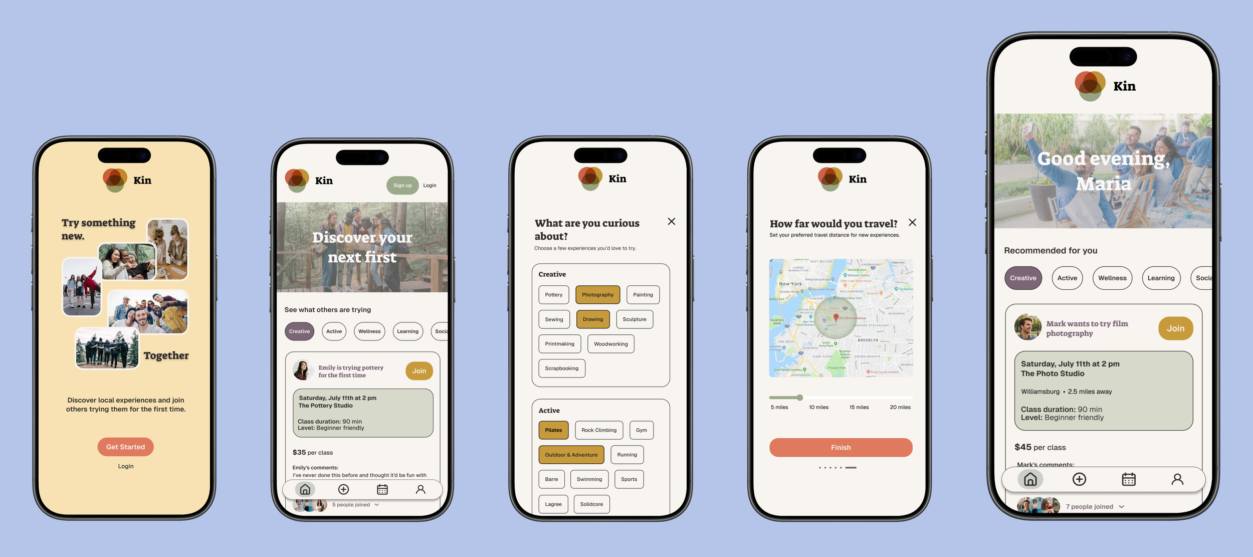
The onboarding experience asks users about their interests, availability, and preferred travel distance to personalize recommendations. This helps users discover experiences that feel relevant without overwhelming them with too many options.
Designed for Quick Decision Making
Experience cards surface the information users care about most, like location, date, and who’s attending. Presenting these details upfront enables users to compare experiences quickly before deciding whether to learn more.
The experience details page was designed to answer the questions users have before committing. Rather than simply presenting logistics, it provides additional context about the experience and what participants can expect, helping reduce uncertainty and encouraging users to take the next step.
Build Confidence Before Joining
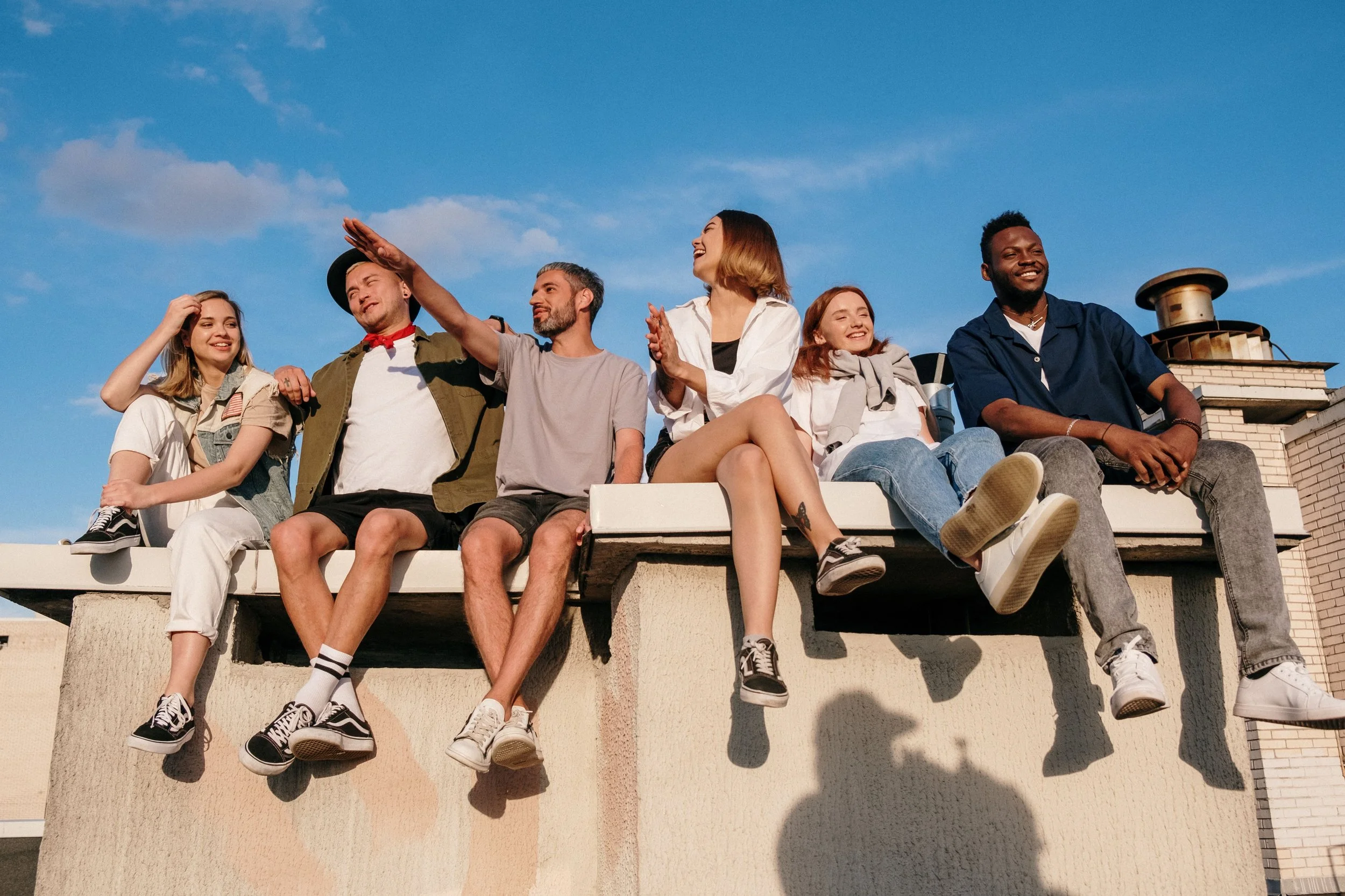
Kin’s branding is rooted in togetherness, curiosity, growth, and courage. Its warm, earthy color palette creates a grounded visual identity designed to inspire ease, comfort, and belonging—helping new experiences feel more approachable. Candid photography captures diverse groups trying something for the first time, sharing meaningful moments, and forming genuine connections. Together, these elements reflect Kin’s purpose: encouraging people to step beyond their comfort zones and discover new experiences alongside others.
Branding
Overview
Usability test findings
Identifying Patterns
Revisions
Usability Testing
Validated the Design Through Usability Testing
I conducted moderated usability tests with both low- and high-fidelity prototypes to evaluate how participants understood the product, navigated the interface, and progressed through the experience discovery flow. Participants were encouraged to think aloud so I could better understand their expectations and decision-making process.
Identified Patterns
Rather than reacting to individual comments, I synthesized recurring themes across participants. Early testing revealed that users wanted more logistical information before joining an experience, leading me to surface details like price, beginner level, and distance directly on the experience cards. Later testing showed users wanted richer contextual information on the details page, including class descriptions confirming that the revised information hierarchy better supported decision-making.
Revisions
Feedback was organized by severity and frequency to determine which changes would have the greatest impact on usability. High-priority revisions focused on clarifying the registration flow, strengthening the experience details page, and improving confirmation messaging, while feature requests such as group chat and attendee messaging were documented as future opportunities beyond the MVP.
Overview
Information hierarchy
Registration experience
Approachable experience
Final design
Next steps
Improved Trust & Decision Making Through Design
Refined the Information Hierarchy
Insights from usability testing led to a clearer separation between browsing and decision-making. Experience cards now provide enough information for users to quickly evaluate opportunities, while the details page offers richer context that helps them feel confident before joining.
Clarified the Registration Experience
Participants were uncertain whether registration occurred within the app or on an external website. To reduce confusion, I refined the registration flow and confirmation messaging to clearly communicate when users were leaving the app and what would happen after completing registration. The registration flow assumes a successful return from the host website. Future iterations would integrate directly with host booking systems to automatically confirm registration.
Designed an Experience That Feels Approachable
The final design emphasizes warmth, clarity, and community throughout the user journey. By combining personalized recommendations, transparent information, and confidence-building touchpoints, Kin encourages users to step outside their comfort zones and discover new experiences in a way that feels welcoming, social, and low-pressure.
I created a reusable UI kit to establish consistency across Kin’s interface and make the product easier to scale. The system includes form fields, buttons, navigation, category filters, activity cards, and their corresponding states. Earthy, grounded colors and softly rounded components create a warm and approachable experience, reflecting Kin’s focus on connection, belonging, and the comfort of trying something new alongside others.
Final Design
Future iterations of Kin would focus on strengthening the sense of community before, during, and after each experience. Introducing group chats and direct messaging would allow attendees to connect before meeting in person, ask questions, coordinate logistics, and build relationships that extend beyond a single event. As the platform grows, partnering with local businesses, studios, and community organizations would expand the variety of experiences available while giving hosts a dedicated space to showcase their classes and reach new audiences. Together, these enhancements would reinforce Kin's mission of making it easier for people to discover meaningful experiences, build genuine connections, and confidently step outside their comfort zones.