

Coffee Notes
Helping Newcomers Navigate Food Spaces
Overview
Role
Product Designer (UI/UX)
Timeline
9 weeks (80+ hours)
Tools Used
Figma
This project is a fictitious scenario, completed as a part of Designlab's UX Academy.
Background
Coffee Notes began as a broader exploration into how people settle into a new place after moving. During interviews, participants consistently returned to stories about cafés, restaurants, and food routines — not just as places to eat, but as spaces where they began to feel oriented, comforted, and connected.
Many described cafés as familiar environments where repeated visits helped them build routine and slowly feel at home in a new city. As someone who also appreciates specialty coffee culture and thoughtfully designed café spaces, I became interested in how digital products could better support those emotional and social experiences.
This insight led me to focus on food spaces as an entry point for helping newcomers navigate a city with less overwhelm and more connection.
Problem
Newcomers lack clear guidance around local food culture and welcoming food spaces, even though food plays a critical role in helping them feel oriented and at home.
Without accessible resources, newcomers rely heavily on word of mouth and trial-and-error, which can delay their sense of belonging.
Project Goals
Create a mobile website that aims to reduce overwhelm by making food discovery contextual, social, and approachable for newcomers.
Understanding User Needs
Research goals & objectives
Research methodologies
Insights
Overview
Research Goals
We want to understand how people who have recently moved use food—such as cafés, restaurants, and grocery routines—to orient themselves, reduce stress, and build a sense of belonging, so that we can design a product that helps them settle into their new neighborhood more easily.
Objectives
Identify the food-related challenges and pain points recent movers experience during their first weeks to two months in a new place, including access, cost, quality, and cultural differences.
Understand how newcomers currently discover local food culture—such as cafés, restaurants, markets, and dining customs.
Examine how communal food and beverage spaces (e.g., coffee shops, markets, casual eateries) contribute to building familiarity, connection, and a sense of belonging.
Methodologies
Competitor Analysis
Identify current tools available for newcomers moving to a new place, their strengths, where they fall short, and potential opportunities.
User Interviews
Understand the emotions behind moving to a new place, routines around settling in, and the pain points and challenges around food.
Insights
Competitor Analysis
All 4 companies (Meetup, Nextdoor, Culture Trip, Spotted by Locals) support newcomers in getting to know a new place by either socializing, learning the latest news, or providing insights on places to stay and things to see.
What they do well
Recommendations for events, sight-seeing, and trending spaces
Offer a wide range of tours and activities
Where they are lacking
Content moderation
Quality control
Insights on local food and beverage spaces
Insights on cultural food and dining norms
Potential Opportunities
Users are looking for cultural discovery
Users are looking to online tools to get to know their neighborhood
Most platforms cater to tourists or established local residents, not necessarily newcomers
User Interviews
Across all interviews, food and local food spots consistently emerged as a primary tool for orientation, emotional comfort, and belonging after moving. Participants used food not only to meet basic needs, but to recreate familiarity, build routines, and ease the emotional stress of transition. However, this process was often slowed or complicated by cultural differences, language, accessibility, cost, and hesitation to explore before feeling settled first.
Newcomers learn a lot only after arriving in a new place — from where to buy groceries and what foods are worth the cost, to when and how people eat. Much of this knowledge is informal and gained through trial and error or conversations with locals, which can make the settling-in process feel slow and overwhelming.
Establish User Pain Points
Persona development
How might we questions
Overview
Persona Development
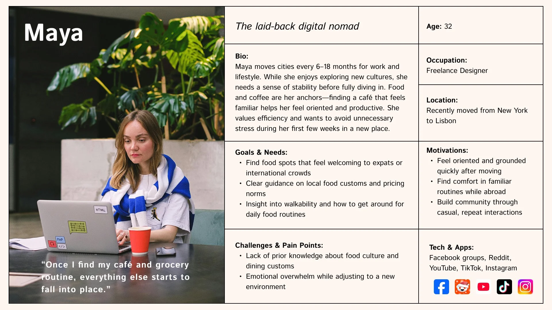
The laid-back digital nomad
The curious cultural explorer
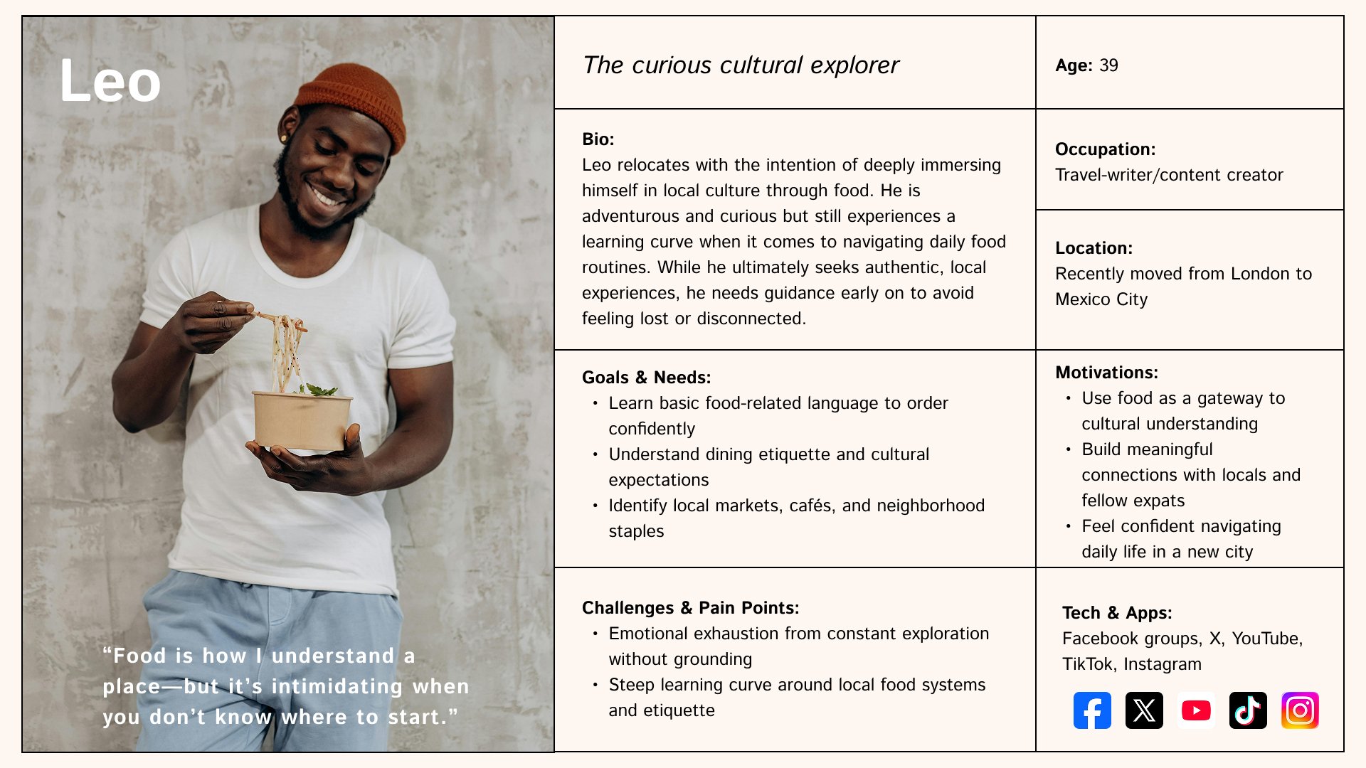
Leo and Maya capture two core user needs: reducing overwhelm and building consistency. They informed design decisions that prioritize clarity, guidance, and habit formation.
How Might We?
I came up with questions to help solve the key problem: newcomers lack clear guidance around local food culture and welcoming food spaces, despite food playing a critical role in helping them feel oriented and at home. Without accessible resources, newcomers rely heavily on word of mouth and experimentation, delaying their sense of belonging in a new environment.
How might we help newcomers find food experiences that feel emotionally comforting and familiar early on in their move?
How might we reduce the anxiety of exploring local food culture by providing context, reassurance, or culturally relevant guidance?
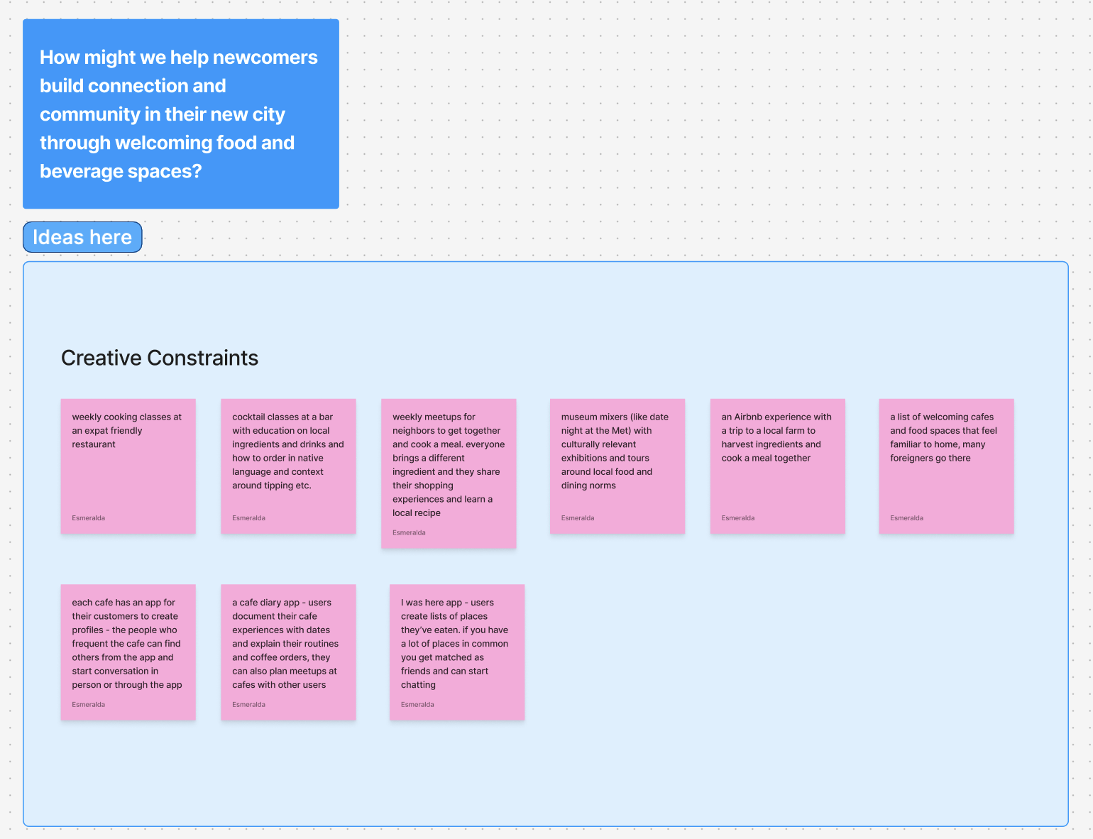
How might we help newcomers build connection and community in their new city through welcoming food and beverage spaces?
Creating the Framework
Ideation
User flow
Overview
Ideation
I approached ideation by applying creative constraints to my “How might we” questions, which helped generate focused and practical solutions to the core problem. From a wide range of concepts, I narrowed in on one that balanced feasibility with a clear gap in the existing market.
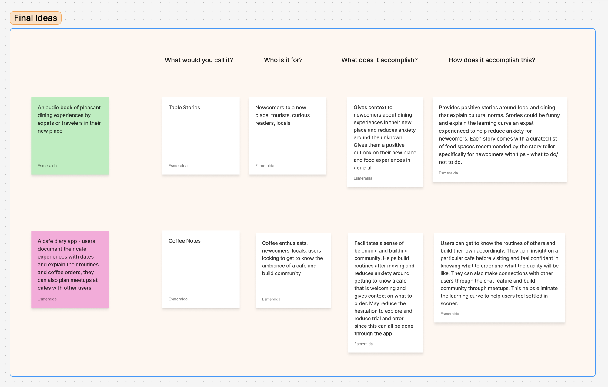
User Flow
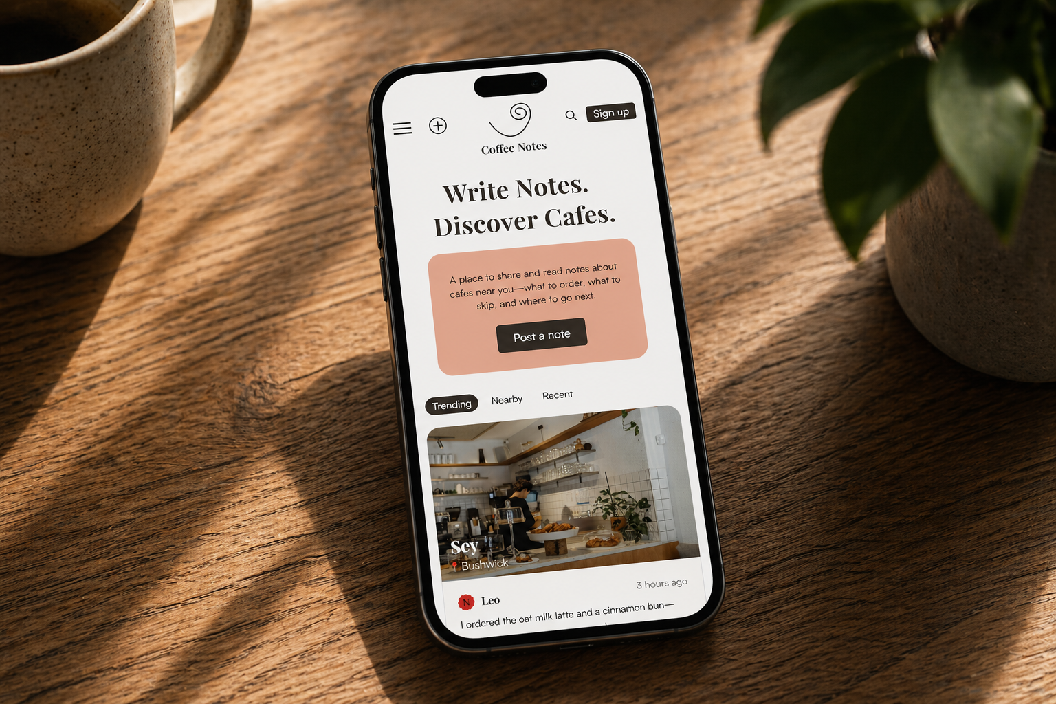
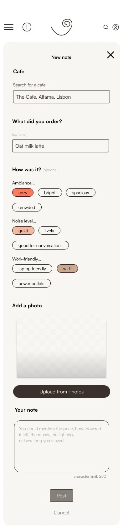
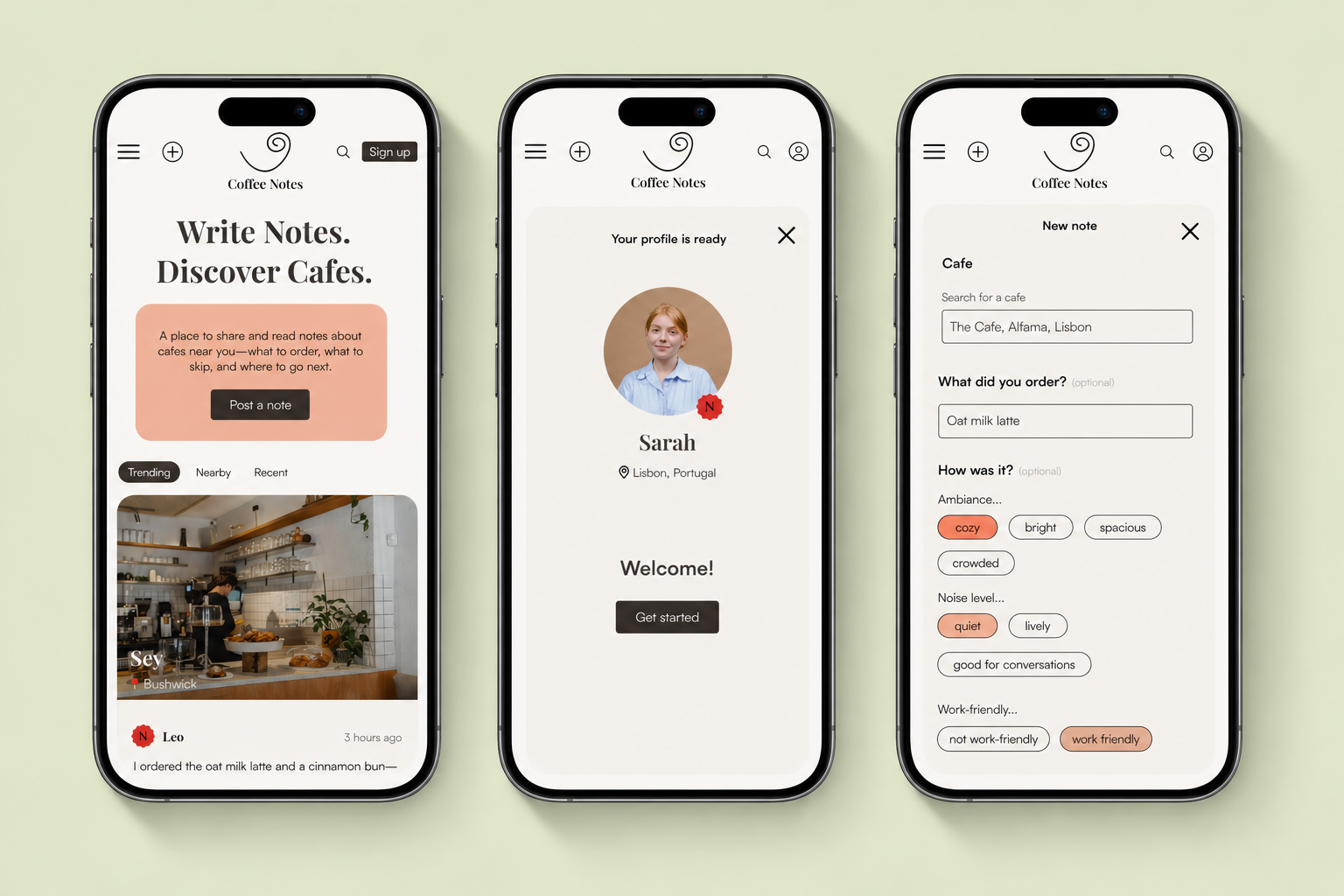
Create First Note
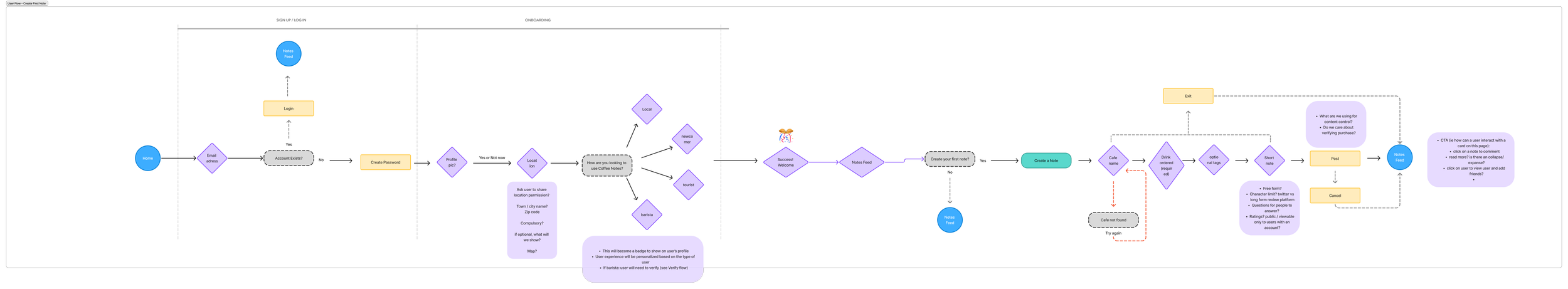
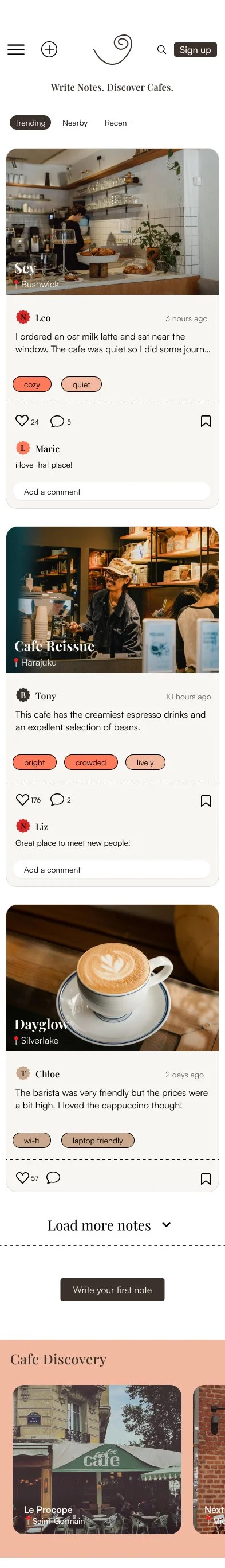
The user flow guides first-time users from exploring the feed to creating their first note. By allowing users to browse content before signing up, the experience demonstrates immediate value, then prompts sign-up at the moment of participation. Success is defined by users contributing their own notes—both to share insights with others and to document their personal coffee routines.
Let’s Start Designing!
Wireframes
Branding
Final Design
Overview
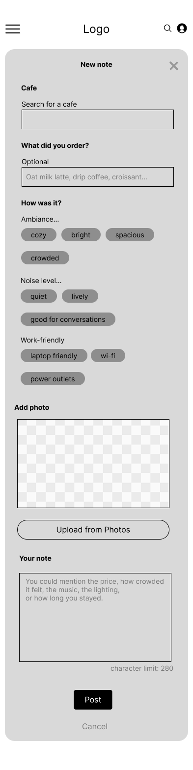
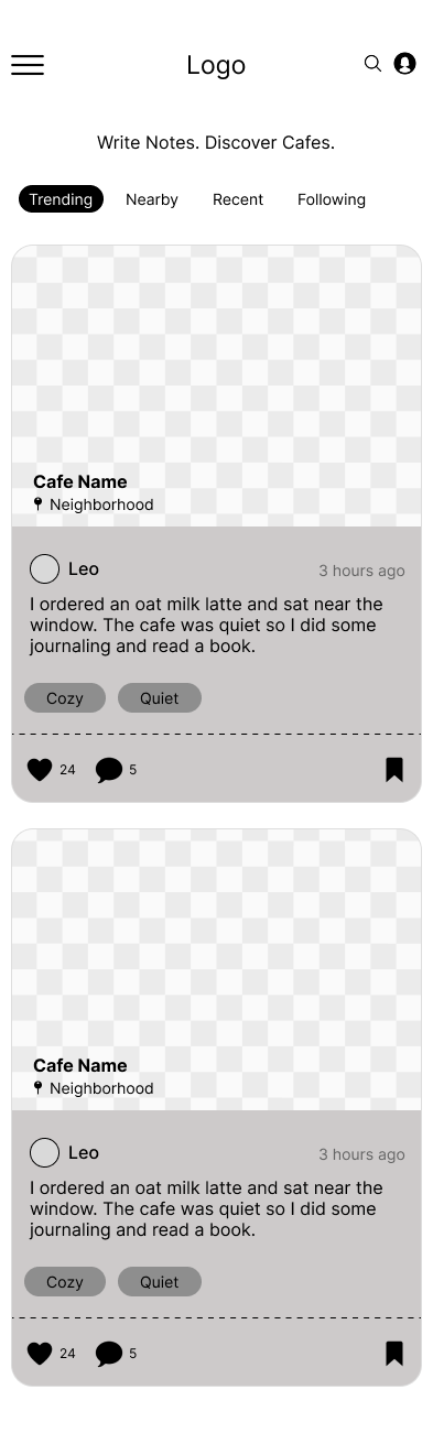
Wireframes
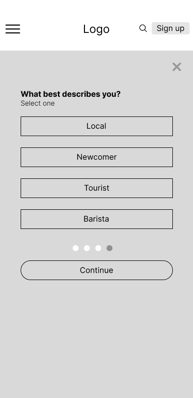
In my low-fidelity wireframes, I prioritized the “coffee note” card as the core of the experience, focusing on clear information hierarchy. The café name is emphasized over the user, while contextual details—like user type (newcomer, local, tourist) and optional tags—are surfaced to make content quickly scannable. Including a photo adds visual context and helps set expectations. I also designed a lightweight onboarding flow with a simple sign-up and progress indicator to reduce friction.
Branding
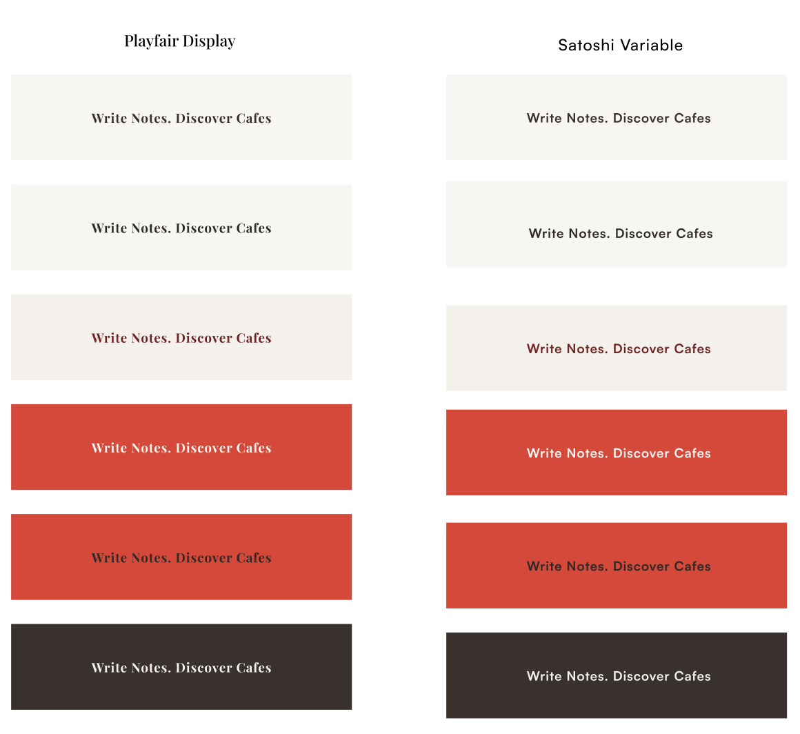
I selected branding elements that evoke warmth and social connection, using a color palette subtly inspired by coffee tones to create a familiar, inviting feel. I paired two complementary typefaces to balance personality and readability, aiming for a tone that feels both youthful and community-oriented.
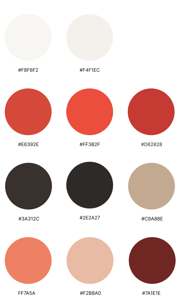
I chose this warm palette with vibrant red to create a space that feels inviting yet exciting — inspiring travel, exploration, and natural social connection through a sense of energy, curiosity, and shared ritual.
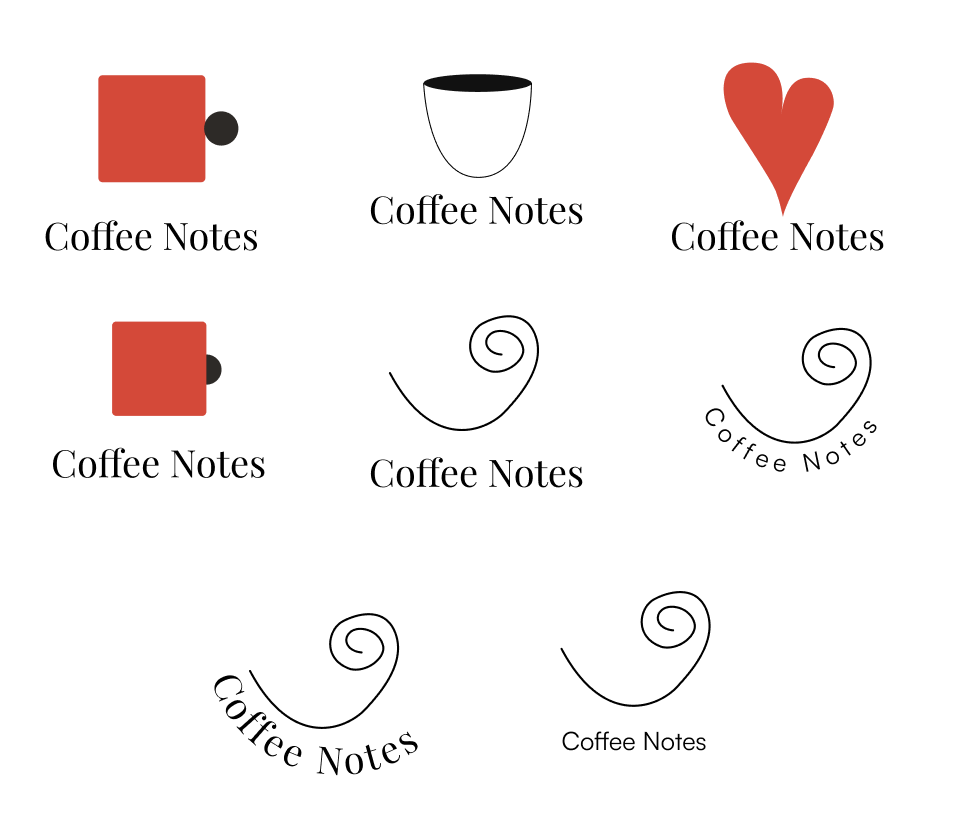
The final logo is an abstract interpretation of coffee steam, designed to feel fluid and expressive rather than literal. I explored a range of coffee-related motifs to develop simplified, abstract forms, ultimately arriving at a mark that feels both distinctive and intentional. Its minimal structure and non-traditional composition balance playfulness with a refined, editorial tone.
Final Design
Usability Testing
Usability test findings
Revisions
Next Steps
Overview
Usability Test Findings
Participants were asked to:
Create an account
Comment on a note
Create their own note
Over time, these interactions support users in developing routines and finding their “third spaces” in a new city.
Overall, users found Coffee Notes intuitive and easy to navigate. The sign-up process felt familiar and straightforward, and most participants quickly understood how to complete it. The “Add comment” feature was especially successful—users consistently found it visible and easy to use. Familiar interface patterns, similar to social platforms like Instagram, helped users quickly understand how to interact with the content.
Despite this ease of use, several patterns emerged that indicate areas for improvement. Users expressed strong hesitation about granting location access, with multiple participants stating they would prefer an “Allow while using the app”option rather than full access. This suggests that location permissions need clearer explanation and more user control.
Another major insight was a lack of context about what Coffee Notes is and how the platform works. Some users were unsure what they were signing up for and questioned whether it involved a membership or payment. Others did not immediately understand that the content cards were called “notes.” Users also showed a preference for skimmable content, often focusing more on comments or tags than longer note text. These findings indicate a need for clearer framing of the platform and improved content hierarchy.
Revisions
From these findings, I prioritized the following revisions:
Add a short description or onboarding message explaining what Coffee Notes is and how users interact with notes.
Improve location permission messaging and include a clearer option such as “Allow while using.”
Make the Add Note action more discoverable, potentially with a plus icon or clearer wording (e.g., “Share your thoughts”).
Clarify that the content cards are called notes and provide more context for first-time users.
Improve content hierarchy and skimmability by emphasizing tags and shortening visible note previews.
Next Steps
Given the scope and timeline of this project, I focused on refining the core features that support note creation and discovery. Looking ahead, I see strong potential for Coffee Notes to evolve into a more socially connected experience. Future iterations could introduce low-pressure ways to connect, such as signaling when you’re at a café and open to meeting up with friends. I also plan to expand the ecosystem by designing profile pages for cafés—highlighting their most popular notes—and introducing features like “regulars” to deepen community engagement. Additionally, creating featured profiles for baristas and cafés would further support the business side of the platform.